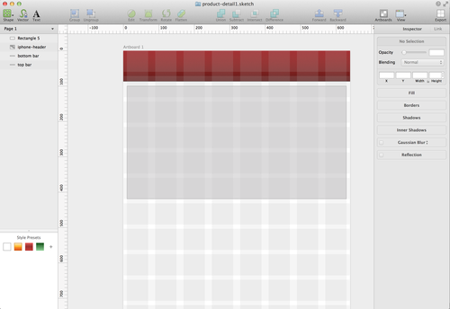
I’ve been using Sketch for high (enough) fidelity mock-ups and wireframes on the retina MBP and right now I feel that:
- $30 is still a bit too expensive (even on a Sale price) for the current features of this app
- $50 (full price) is just not worth it
Although of course, I’m mostly willing to spend a little more on some apps that would look good on the Retina which is why I bought it in the first place. I still end up opening Photoshop and Illustrator to get some things done (quickly).
Sketch is pretty much similar to how I use Adobe Fireworks because it makes grids, alignments, and resizing easier than some apps (some shortcuts were easy enough to guess). I just have a few things to complain about:
- ‘V’ is the shortcut key on Photoshop for the arrow so I would often press it on Sketch. On Sketch however, it’s also the same key for the Vector tool so I end up accidentally adding points on my canvas. It’s annoying to have to undo so often.
- There is no crop. Which is crazy inconvenient because I’d get some stock photos on the internet for an mobile app mock-up and I just…can’t crop it. Allan crops in Preview. Which for a $30 app to lack is crazy ridiculous.
** I asked at their support forum and there is an alternative, which means selecting and deleting. Still, not really crop yet.
- It crashes. A lot. Although it saves and reloads pretty fast, it’s still a little annoying.
- There are still some vector functionalities in Illustrator that I need, which I haven’t been able to do on Sketch such as Expand Appearance. I’m not used to the vector tool in Sketch yet either.
At the end of the day I look at my screen and it’s not pixelized and I think it’s still a little bit worth it.


Leave a Reply