While I was looking for an organization to donate to, so I could help in some way families who have been devastated by the typhoon. There was one site that stood out from those that I’ve looked at (which aren’t many, to be honest): Unicef (PH)’s donate page.
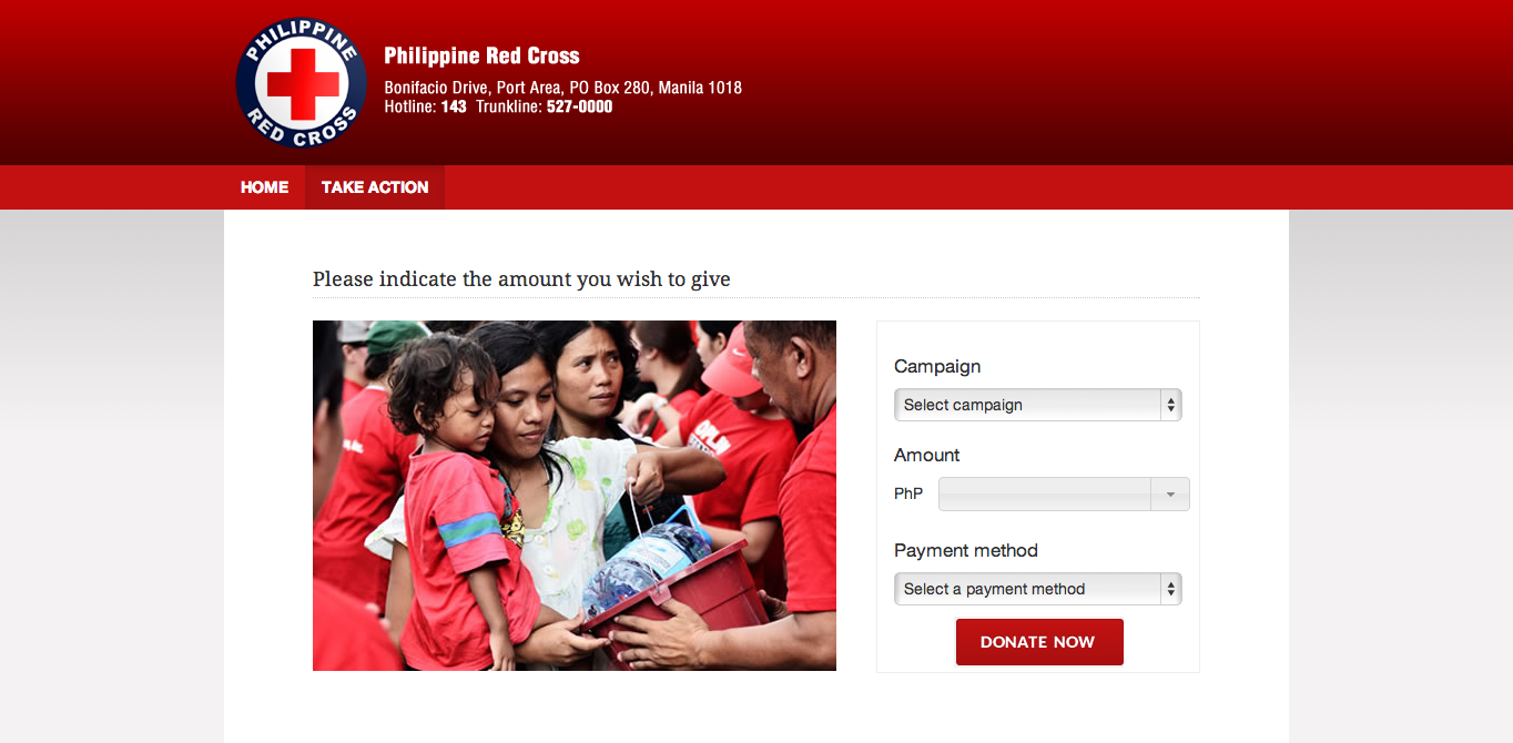
Most sites that would ask for money look like this: you have a simple form that asks for the amount you want to give, sometimes options for specific campaigns, method of payment, etc.

I know it’s Red Cross and is probably trust-worthy, but I could imagine some kind of misappropriation of funds. What if????
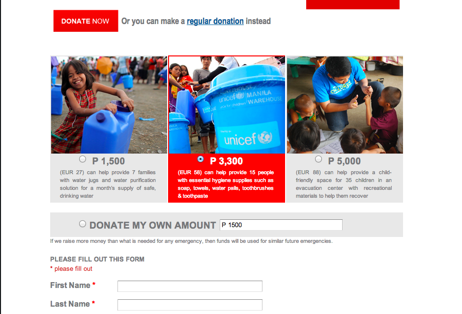
Unicef’s form, however, builds reassurance or trust. It shows me where my money will go or what exactly it will be spent on, which is especially helpful when you have a corrupt government and you’re just bred to distrust.

The photos are also a nice touch to show me what exactly I’m donating with my money.
Not that I don’t trust Red Cross, but there are a couple of other sites I have never heard of, nor have known people affiliated with them that would vouch for trustworthiness. The Unicef form is definitely a good example of where to start when it comes to designing for emotion.


Leave a Reply