

C asked me how I liked the new design of SMART’s User Account Page, and I said it was pretty bad. It was one of those examples of “style over function” because even if it looks neater than the old version, my experience as a customer was worse than before.
I only ever log in to check my balance whenever I have to pay my bill. C logs in to pay his bill from the Bancnet link on the site. To be honest, I can’t remember how it used to look like, but I’m pretty sure I had an easier time looking for my bills and paying with the old layout than the new one.
To illustrate — this is the screen that I see once I’ve selected the account to “manage”:
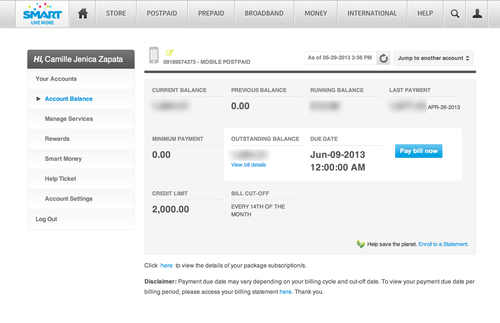
I saw my outstanding balance, but a few days ago I got a weird “0 balance” email from SMART, so I wanted to first check my old billing statements to find out the last bill I’ve paid. This is the first link I try to click: 
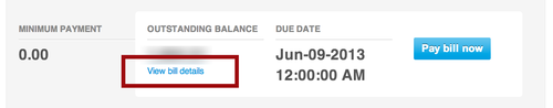
Apparently, it doesn’t work. My clicks do nothing, and the page I’m at is the entire “Account Balance” page. There was a “View bill details” link there below my “Outstanding Balance” which I didn’t really notice at first, so I decide to click it thinking it will open up the PDF copy of my current balance’s billing statement.
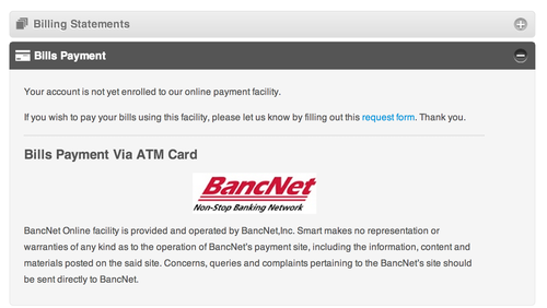
And then it brings me to:
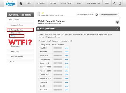
The billing page.
Well, ok, I still can’t equate “View bill details” = list of all billing statements. It made more sense in my head that it was the billing statement that was related to my Outstanding Balance.
And so, apparently the Billing Page is under “Manage Services” instead of “Account Balance”.
I’m sure I’m not the only one who would assume I’ll find my statements under “Account Balance.” It is, after all, related to accounts and money. This is obviously a bad case of Information Architecture and I wonder if SMART’s design team tested this particular layout on any human being. If they really wanted to push it, how hard was it to put a “Billing Statements” button from the Account Balance page because it really sounds like Balances = Money = Bills!
What else could they have “RE-DESIGNED”? Why not add a “Paid” status (or unpaid) or even show the total balance in each row of the billing statements? I had to assume it was the most recent one, but if I really wanted to check if my billing statement had the same balance as the one on the Account Balance page, I must open the PDF.
Likewise, the ATM link was under “Bills Payment”, which C couldn’t find initially because he couldn’t associate paying bills with “Manage Services”
Whatever the internal name SMART has for these billing things are definitely not what their customers would assume or think of. “Manage Services”? Sounds like it’s where it says I’m subscribed to their network still, or the length of my contract, or if I’ll be terminating my contract, etc etc.
If they only invested a little time into their info architecture, it would have saved me a good few minutes.


Leave a Reply