From a recent thread on the Philippine Web Designers group on Facebook, a site was brought to my attention: http://kristn.com/
I haven’t really browsed through the entire site yet. Upon landing on the page though, I had no idea what it was. All I saw was this sunshine of images I didn’t understand and promptly went back to the Facebook thread to ask instead what it was. I was redirected to this article on theBobbery, which had a brief synopsis:
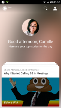
Kristn is a new Lifestyle Assistant, an exciting project by TV5/Interaksyon. What is interesting about Kristn is how the platform will recommend content to users, based on how they use and interact with the platform. Kristn is still in Beta but the crew hopes to release the mobile applications in the next weeks. And Carlo reveals that the platform will soon also have a TV show.
Sounds great on paper, yeah? But the execution was horrible, not to mention very bad branding. “Kristn” — I mistyped it the first time, and if you’re building an online brand/presence, this can be a bad set-back.
If there’s anything I learned from Startup Weekend Manila last year (2012), your product’s name is important: how it’s spelled, if it’s easy to remember, if it’s easy to type. Before launching commute.ph, we were almost going to launch it as “komyutips.com”. The domain has already been bought, branding was done, and we thought the name was a creative version of “commuting tips.”
Except let’s face it, commute.ph is more direct to the point, foreigner-friendly, and less prone to spelling mistakes. (How would you tell a person to check out komyutips anyway? Go to komyutips.com, but use a “K” not a “C”. Sounds bad.) We were told about the bad branding by our mentors there, and even if we had to shell out more money for a new domain, try to wrack my head around some kind of temporary branding for the SW Manila presentation, and redirect customers from the old Facebook fan page to the new Facebook page, we decided to go through it. With new competitors coming up, I’m glad we did.
It’s same with “Kristn” — it’s not “kristin”, or a more popular spelling of the name. If someone told me to check out “Kristn”, how would they say it? “Go to kristn.com, it’s like kristine, but without an ‘I’ or an ‘E’.” That sounds bad too. It probably kept a few people away from your site.
Then again, the homepage tells me so little about what to expect or what it’s about, and doesn’t highlight what’s great in the site: its content. One of the articles that I checked out (or the only article I checked out, for now) was: 5 Things We Learned at Google Philippines Launch because it didn’t sound like the same old “Google puts up office in Manila” news.
So as a whole, Kristn seems like it had some solid idea behind it, and as Franky mentioned on the Facebook thread:
But they have a rather cool recommendation algo and then also check-in and other novel features upcoming.
Unfortunately, with their homepage so badly designed, and a name that doesn’t quite stand out like Rappler does, I feel apprehensive about this site fading completely in the background. None of my friends share articles from this site, or tweet things from this site, and that’s very telling.
I still want to check out some of the content though, but I have to try to see if it works on any of my readers first.





Leave a Reply